spring 2023
graphical user interface
Groupwork By
Tara, Anja, andy, david

Concept
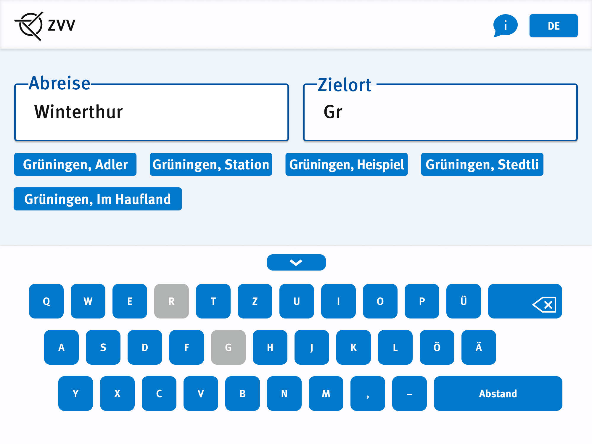
We focused on the zones and the tickets. The ticket purchasing process in Canton Zurich lacks clarity regarding point A to point B tickets. There is not enough suggestion that you validate zones, instead of the one connection. Our data also indicates that the ticket purchasing process is perceived as confusing, and one of the most commonly mentioned concerns among users is the fear of purchasing the wrong ticket.
Go on and try our clickable prototype


process
The ZVV-UI Redesign started with research. We started by interviewing people at the Zurich HB to find out what the people think about the ticket machines in general. We found out that people at the train or tram stations are generally stressed and the machines are confusing especially for tourists or older people. Here you can see out individual group summaries of the interviews we held.


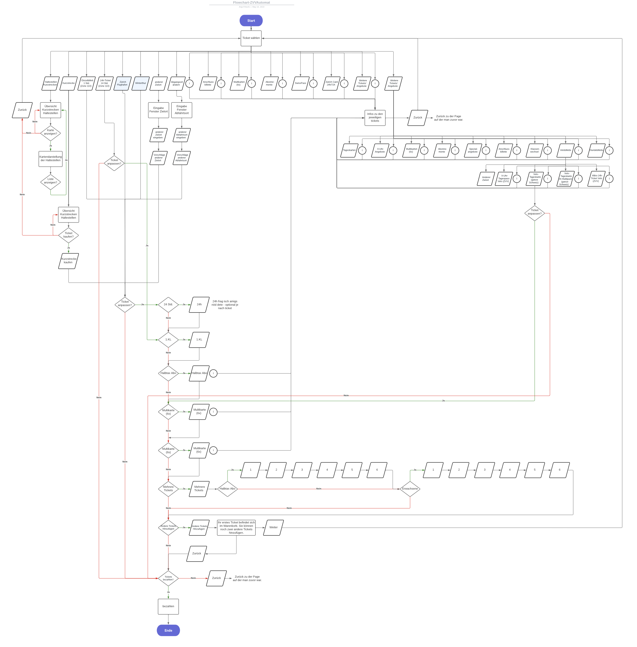
In this step we created different flowcharts of the ticket purchasing of the ZVV app, ZVV machine and the SBB app After creating the whole flowcharts we saw similarities and differences between the systems and found out what works and what not.

After we had settled on a rough design, we took it and asked some people whether they would be willing to participate in usability tests. For the initial tests, we mostly asked people in our circles as the design wasn’t too fleshed out yet and still contained flaws we were aware of. To conduct the tests, we asked the participants to select their destination, ...a connection, ...modify their ticket and finally confirm their purchase. They were asked to be vocal about their steps. What was important for us during these first tests, was to get a general feeling of what people think, when they click through the screens. The feedback was discussed and then digitalized for a clear overview of what needs improvement.


